

 WEB Development
 Styling
 Bootstrap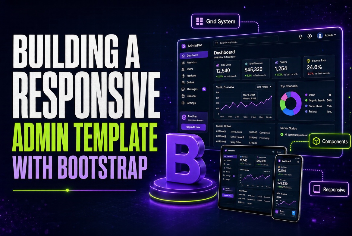
Last year It sold an admin template on ThemeForest. It made more in three months than day-to-day engineering work pays in a year. The thing that surprised the team wasn't the money — it was how much the template's quality depended on small, almost invisible decisions. The sidebar collapse animation. The way the table row hovers. The fact that the search input works with / keyboard shortcut. Buyers notice details. Users notice details. If you're building an admin template with Bootstrap, these details are what separate a $20 template from a $200 one.
Why This Matters
Admin templates are some of the most-reused code in the industry. A good template gets installed on dozens of projects and shapes thousands of user experiences. The market is competitive — buyers compare side-by-side. The differentiators in 2026 are responsive behavior, dark mode, accessibility, and a small but polished set of details that make daily use pleasant.
There's a real business case for building your own. If you maintain multiple admin projects, a template saves weeks of work per project. If you freelance, templates are recurring revenue. If you work in-house, the template becomes your team's shared vocabulary for layouts. The investment pays back within months.
At the agency, we maintain an internal template called "Atlas" that we use for client projects. It started as a fork of a popular admin template and evolved over three years into something more useful. The current version has 60+ components, full dark mode, RTL support, and accessibility tested at AA. Each new project takes 30% less time to set up than it did before we had Atlas.
The Core Idea
A great admin template has four pillars:
Pillar 1: Layout shell that adapts everywhere. The sidebar collapses to offcanvas on mobile, persists on tablet, expands on desktop. The top bar shrinks and shows only essentials. The content area uses fluid containers. Breakpoints must be carefully chosen — defaults don't always work for admin density.
Pillar 2: Navigation that scales. Admins have many sections. A flat sidebar gets unwieldy after 15 items. You need collapsible groups, breadcrumbs for deep navigation, and a search-as-you-type for power users. Bootstrap's collapse, accordion, and dropdown components handle the basics; search needs custom JavaScript.
Pillar 3: Components designed for density. Admin UIs show lots of data in limited space. Tables need to be dense without being cramped. Forms need labels and inputs aligned even on narrow screens. Cards need to convey status at a glance. Bootstrap's spacing and grid utilities need careful application — too much whitespace looks unprofessional; too little is unreadable.
Pillar 4: A coherent dark mode. Not just inverted colors — every component needs thoughtful treatment. Tables need subtle borders. Borders need to remain visible but not heavy. Shadows need to be more pronounced (they don't show as well on dark backgrounds). Charts need different color palettes. Bootstrap 5.3's CSS variable system makes this possible without forking the framework.
Beyond these pillars, every great template has the small details: smooth transitions, keyboard shortcuts, empty states, loading states, confirmation dialogs for destructive actions. These are the difference between a template that sells and one that doesn't.
A Concrete Example
Let's build a "starter" admin template that demonstrates all four pillars. We'll call it "Nimbus." The template will have a collapsible sidebar, a top bar with search, a content area with stats and a table, and full dark mode support.
<!DOCTYPE html>
<html lang="en" data-bs-theme="light">
<head>
  <meta charset="UTF-8">
  <meta name="viewport" content="width=device-width, initial-scale=1">
  <title>Nimbus Admin</title>
  <link href="https://cdn.jsdelivr.net/npm/bootstrap@5.3.3/dist/css/bootstrap.min.css" rel="stylesheet">
  <link href="https://cdn.jsdelivr.net/npm/bootstrap-icons@1.11.3/font/bootstrap-icons.min.css" rel="stylesheet">
  <style>
    /* Density tuning */
    .admin-table { font-size: 0.875rem; }
    .admin-table td, .admin-table th { padding: 0.625rem 0.75rem; }
    .sidebar-nav .nav-link {
      padding: 0.5rem 0.875rem;
      font-size: 0.9rem;
      border-radius: 0.375rem;
    }
    .sidebar-nav .nav-link.active {
      background: var(--bs-primary-bg-subtle);
      color: var(--bs-primary);
      font-weight: 600;
    }
    /* Hover effect for cards */
    .stat-card { transition: transform 150ms ease, box-shadow 150ms ease; }
    .stat-card:hover {
      transform: translateY(-2px);
      box-shadow: 0 4px 16px rgba(0,0,0,0.06);
    }
    /* Dense form */
    .dense-form .form-control,
    .dense-form .form-select { padding: 0.4rem 0.75rem; font-size: 0.9rem; }
  </style>
</head>
<body class="bg-body-tertiary">

<!-- Top bar -->
<nav class="navbar navbar-expand-lg bg-body border-bottom sticky-top">
  <div class="container-fluid">
    <button class="btn btn-link text-body p-0 me-2 d-lg-none" type="button"
            data-bs-toggle="offcanvas" data-bs-target="#sidebarOffcanvas">
      <i class="bi bi-list fs-4"></i>
    </button>

    <a class="navbar-brand fw-bold" href="#">
      <i class="bi bi-hexagon-fill text-primary"></i> Nimbus
    </a>

    <!-- Search -->
    <div class="d-none d-md-block flex-grow-1 mx-4" style="max-width: 400px;">
      <div class="input-group input-group-sm">
        <span class="input-group-text bg-body-tertiary border-end-0">
          <i class="bi bi-search text-body-secondary"></i>
        </span>
        <input type="search" class="form-control border-start-0"
               placeholder="Search (press /)..." id="globalSearch">
        <span class="input-group-text bg-body-tertiary border-start-0">
          <kbd>/</kbd>
        </span>
      </div>
    </div>

    <div class="d-flex align-items-center gap-2">
      <button class="btn btn-link text-body p-1" id="themeToggle">
        <i class="bi bi-moon-stars"></i>
      </button>
      <div class="dropdown">
        <button class="btn btn-link text-body p-0" data-bs-toggle="dropdown">
          <i class="bi bi-bell fs-5"></i>
        </button>
        <span class="position-absolute translate-middle badge rounded-pill bg-danger"
              style="font-size: 0.6rem; margin-left: -8px; margin-top: 4px;">
          3
        </span>
        <ul class="dropdown-menu dropdown-menu-end shadow-sm">
          <li><h6 class="dropdown-header">Notifications</h6></li>
          <li><a class="dropdown-item" href="#">New order #1234</a></li>
          <li><a class="dropdown-item" href="#">Server CPU at 92%</a></li>
          <li><a class="dropdown-item" href="#">New user signed up</a></li>
        </ul>
      </div>
      <div class="dropdown">
        <button class="btn btn-link text-body p-0" data-bs-toggle="dropdown">
          <div class="bg-primary-subtle rounded-circle d-flex align-items-center justify-content-center"
               style="width: 32px; height: 32px;">
            <strong class="text-primary small">JD</strong>
          </div>
        </button>
        <ul class="dropdown-menu dropdown-menu-end shadow-sm">
          <li><a class="dropdown-item" href="#">Profile</a></li>
          <li><a class="dropdown-item" href="#">Settings</a></li>
          <li><hr class="dropdown-divider"></li>
          <li><a class="dropdown-item" href="#">Sign out</a></li>
        </ul>
      </div>
    </div>
  </div>
</nav>

<div class="container-fluid">
  <div class="row">

    <!-- Desktop sidebar -->
    <aside class="col-lg-2 d-none d-lg-block bg-body border-end p-3 vh-100 sticky-top"
           style="top: 56px; overflow-y: auto;">
      <ul class="nav flex-column sidebar-nav gap-1">
        <li><a href="#" class="nav-link active">
          <i class="bi bi-speedometer2"></i> Dashboard
        </a></li>
        <li><a href="#" class="nav-link text-body">
          <i class="bi bi-people"></i> Users
        </a></li>
        <li><a href="#" class="nav-link text-body">
          <i class="bi bi-box"></i> Products
        </a></li>
        <li>
          <a href="#ordersSubmenu" class="nav-link text-body"
             data-bs-toggle="collapse">
            <i class="bi bi-cart"></i> Orders
            <i class="bi bi-chevron-down float-end small"></i>
          </a>
          <ul class="collapse nav flex-column ms-3" id="ordersSubmenu">
            <li><a href="#" class="nav-link text-body small">All orders</a></li>
            <li><a href="#" class="nav-link text-body small">Pending</a></li>
            <li><a href="#" class="nav-link text-body small">Shipped</a></li>
          </ul>
        </li>
        <li><a href="#" class="nav-link text-body">
          <i class="bi bi-bar-chart"></i> Analytics
        </a></li>
        <li><a href="#" class="nav-link text-body">
          <i class="bi bi-gear"></i> Settings
        </a></li>
      </ul>
    </aside>

    <!-- Mobile sidebar -->
    <div class="offcanvas offcanvas-start" tabindex="-1" id="sidebarOffcanvas">
      <div class="offcanvas-header">
        <h5 class="offcanvas-title">Menu</h5>
        <button type="button" class="btn-close" data-bs-dismiss="offcanvas"></button>
      </div>
      <div class="offcanvas-body">
        <ul class="nav flex-column sidebar-nav gap-1">
          <li><a href="#" class="nav-link active">
            <i class="bi bi-speedometer2"></i> Dashboard
          </a></li>
          <li><a href="#" class="nav-link text-body">
            <i class="bi bi-people"></i> Users
          </a></li>
          <li><a href="#" class="nav-link text-body">
            <i class="bi bi-box"></i> Products
          </a></li>
          <li><a href="#" class="nav-link text-body">
            <i class="bi bi-cart"></i> Orders
          </a></li>
        </ul>
      </div>
    </div>

    <!-- Main content -->
    <main class="col-lg-10 col-12 p-4">

      <!-- Page header -->
      <div class="d-flex justify-content-between align-items-center mb-4">
        <div>
          <h1 class="h3 fw-bold mb-1">Dashboard</h1>
          <nav aria-label="breadcrumb">
            <ol class="breadcrumb mb-0 small">
              <li class="breadcrumb-item"><a href="#">Home</a></li>
              <li class="breadcrumb-item active">Dashboard</li>
            </ol>
          </nav>
        </div>
        <div class="d-flex gap-2">
          <button class="btn btn-outline-secondary btn-sm">
            <i class="bi bi-download"></i> Export
          </button>
          <button class="btn btn-primary btn-sm">
            <i class="bi bi-plus-lg"></i> New
          </button>
        </div>
      </div>

      <!-- Stat cards -->
      <div class="row row-cols-1 row-cols-md-2 row-cols-xl-4 g-3 mb-4">
        <div class="col">
          <div class="card border-0 shadow-sm stat-card h-100">
            <div class="card-body">
              <p class="text-body-secondary small mb-1">Total revenue</p>
              <h2 class="h3 fw-bold mb-0">$48,210</h2>
              <small class="text-success">
                <i class="bi bi-arrow-up"></i> 12.5%
              </small>
            </div>
          </div>
        </div>
        <div class="col">
          <div class="card border-0 shadow-sm stat-card h-100">
            <div class="card-body">
              <p class="text-body-secondary small mb-1">New customers</p>
              <h2 class="h3 fw-bold mb-0">847</h2>
              <small class="text-success">
                <i class="bi bi-arrow-up"></i> 5.2%
              </small>
            </div>
          </div>
        </div>
        <div class="col">
          <div class="card border-0 shadow-sm stat-card h-100">
            <div class="card-body">
              <p class="text-body-secondary small mb-1">Active sessions</p>
              <h2 class="h3 fw-bold mb-0">2,341</h2>
              <small class="text-danger">
                <i class="bi bi-arrow-down"></i> 1.8%
              </small>
            </div>
          </div>
        </div>
        <div class="col">
          <div class="card border-0 shadow-sm stat-card h-100">
            <div class="card-body">
              <p class="text-body-secondary small mb-1">Conversion rate</p>
              <h2 class="h3 fw-bold mb-0">3.4%</h2>
              <small class="text-success">
                <i class="bi bi-arrow-up"></i> 0.6%
              </small>
            </div>
          </div>
        </div>
      </div>

      <!-- Data table -->
      <div class="card border-0 shadow-sm">
        <div class="card-header bg-transparent border-bottom d-flex justify-content-between align-items-center">
          <h2 class="h5 fw-bold mb-0">Recent orders</h2>
          <div class="input-group input-group-sm" style="max-width: 200px;">
            <input type="search" class="form-control" placeholder="Search orders...">
            <span class="input-group-text"><i class="bi bi-search"></i></span>
          </div>
        </div>
        <div class="table-responsive">
          <table class="table table-hover admin-table mb-0">
            <thead class="table-light">
              <tr>
                <th>Order #</th>
                <th>Customer</th>
                <th>Date</th>
                <th>Status</th>
                <th>Total</th>
                <th></th>
              </tr>
            </thead>
            <tbody>
              <tr>
                <td><strong>#10234</strong></td>
                <td>Jane Cooper</td>
                <td class="text-body-secondary">Jul 18, 2026</td>
                <td><span class="badge text-bg-success">Completed</span></td>
                <td>$320.00</td>
                <td class="text-end">
                  <div class="dropdown">
                    <button class="btn btn-link btn-sm text-body p-0"
                            data-bs-toggle="dropdown">
                      <i class="bi bi-three-dots"></i>
                    </button>
                    <ul class="dropdown-menu dropdown-menu-end">
                      <li><a class="dropdown-item" href="#">View</a></li>
                      <li><a class="dropdown-item" href="#">Edit</a></li>
                      <li><hr class="dropdown-divider"></li>
                      <li><a class="dropdown-item text-danger" href="#">Delete</a></li>
                    </ul>
                  </div>
                </td>
              </tr>
              <tr>
                <td><strong>#10235</strong></td>
                <td>Cody Fisher</td>
                <td class="text-body-secondary">Jul 18, 2026</td>
                <td><span class="badge text-bg-warning">Pending</span></td>
                <td>$184.50</td>
                <td class="text-end">
                  <div class="dropdown">
                    <button class="btn btn-link btn-sm text-body p-0"
                            data-bs-toggle="dropdown">
                      <i class="bi bi-three-dots"></i>
                    </button>
                    <ul class="dropdown-menu dropdown-menu-end">
                      <li><a class="dropdown-item" href="#">View</a></li>
                      <li><a class="dropdown-item" href="#">Edit</a></li>
                      <li><hr class="dropdown-divider"></li>
                      <li><a class="dropdown-item text-danger" href="#">Delete</a></li>
                    </ul>
                  </div>
                </td>
              </tr>
              <tr>
                <td><strong>#10236</strong></td>
                <td>Leslie Alexander</td>
                <td class="text-body-secondary">Jul 17, 2026</td>
                <td><span class="badge text-bg-info">Processing</span></td>
                <td>$2,140.00</td>
                <td class="text-end">
                  <div class="dropdown">
                    <button class="btn btn-link btn-sm text-body p-0"
                            data-bs-toggle="dropdown">
                      <i class="bi bi-three-dots"></i>
                    </button>
                    <ul class="dropdown-menu dropdown-menu-end">
                      <li><a class="dropdown-item" href="#">View</a></li>
                      <li><a class="dropdown-item" href="#">Edit</a></li>
                      <li><hr class="dropdown-divider"></li>
                      <li><a class="dropdown-item text-danger" href="#">Delete</a></li>
                    </ul>
                  </div>
                </td>
              </tr>
            </tbody>
          </table>
        </div>
        <div class="card-footer bg-transparent d-flex justify-content-between align-items-center small">
          <span class="text-body-secondary">Showing 1-3 of 847</span>
          <nav>
            <ul class="pagination pagination-sm mb-0">
              <li class="page-item disabled"><a class="page-link" href="#">Previous</a></li>
              <li class="page-item active"><a class="page-link" href="#">1</a></li>
              <li class="page-item"><a class="page-link" href="#">2</a></li>
              <li class="page-item"><a class="page-link" href="#">3</a></li>
              <li class="page-item"><a class="page-link" href="#">Next</a></li>
            </ul>
          </nav>
        </div>
      </div>

    </main>
  </div>
</div>

<script src="https://cdn.jsdelivr.net/npm/bootstrap@5.3.3/dist/js/bootstrap.bundle.min.js"></script>
<script>
  // Theme toggle
  document.getElementById('themeToggle').addEventListener('click', () => {
    const html = document.documentElement;
    const next = html.getAttribute('data-bs-theme') === 'dark' ? 'light' : 'dark';
    html.setAttribute('data-bs-theme', next);
    localStorage.setItem('theme', next);
  });

  // Keyboard shortcut: / focuses search
  document.addEventListener('keydown', (e) => {
    if (e.key === '/' && document.activeElement.tagName !== 'INPUT') {
      e.preventDefault();
      document.getElementById('globalSearch').focus();
    }
  });
</script>
</body>
</html>
This template demonstrates all four pillars. The layout shell collapses to offcanvas on mobile, persists on desktop. The navigation has a nested collapse for "Orders." The components are density-tuned with smaller padding. The dark mode toggle works instantly. The keyboard shortcut for search is a small detail that power users love.
Common Pitfalls
Density that's too aggressive. Cramming too much into the UI makes it unreadable. Find the balance — dense, but not cramped.
Sidebar that doesn't stick on scroll. Long admin pages need the sidebar to remain accessible. Use
sticky-topon the desktop sidebar.Tables that overflow on tablets. Wrap them in
<div class="table-responsive">and consider hiding non-essential columns on smaller screens.Theme toggle that flashes on page load. Set the theme from
localStoragebefore render to avoid the "white flash then dark" effect.Missing keyboard navigation. Make sure modals, dropdowns, and tabs are keyboard-accessible. Tab order should follow visual order.
Not testing on actual mobile devices. Simulator previews miss touch target sizes, scroll behavior, and real performance. Test on real phones.
When to Use This (And When Not To)
This template approach is right for teams building admin-heavy products, agencies that build many similar projects, freelancers selling templates, and companies that need an internal "kit" for consistency. The investment pays back when you'll use it more than once.
It's the wrong approach for one-off admin pages that won't be reused, for projects where the design needs to be highly bespoke, or when the team is small enough that the template's overhead exceeds its benefits.
Wrapping Up
A great admin template is a foundation you build on once and use for years. The four pillars — adaptive layout, scalable navigation, dense components, and coherent dark mode — give you 80% of the value. The remaining 20% is in the small details: keyboard shortcuts, smooth transitions, empty states, accessibility. These details are what separate a template you tolerate from one you love using.
There's also a philosophical point here. Templates reduce decision fatigue. When every new project starts from a known, well-tested foundation, your team spends energy on the unique problems of the project rather than rebuilding the same layout for the hundredth time. The accumulated knowledge in a template — which patterns work, which break, which look polished — becomes institutional knowledge that survives team turnover.
The most successful templates Documentation and common practice have share a common trait: they're opinionated. They don't try to be everything to everyone. They pick a design direction and commit. The opinionated choices become strengths because users know what to expect. A template that tries to support every variation ends up being hard to customize because every customization fights a different default.
Your next step: pick one admin project you've built or are building. Extract its layout shell, sidebar, top bar, and a few core components into a separate template project. Add dark mode. Use it on your next project. Iterate. In a year you'll have a template worth selling — or at minimum, worth keeping as your team's secret weapon.
Further Reading

Hermes Smith