

 WEB Development
 Styling
 Tailwind CSS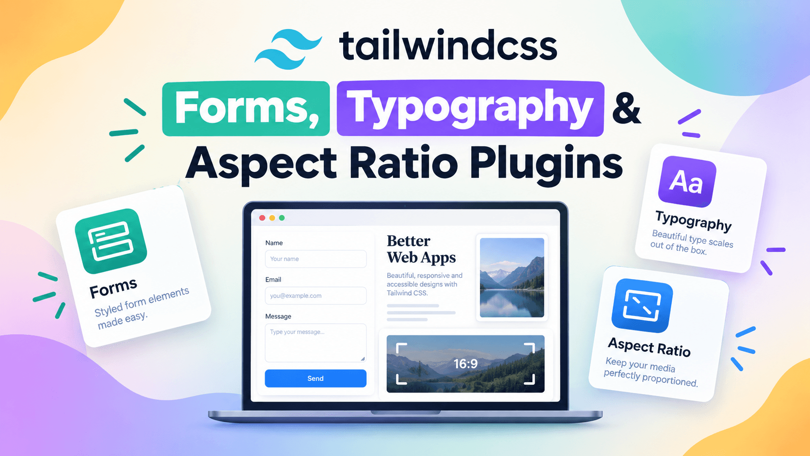

There's a moment in every Tailwind project's life where you add a plain <input> to a page, refresh, and stare at the unstyled HTML default: the beveled edge, the inherited font, the mystery padding. You can spend twenty minutes rebuilding what @tailwindcss/forms gives you in one import. Same story with prose content, where you paste a Markdown blog post and suddenly your H1 looks like body copy. These three plugins — Forms, Typography, and Aspect Ratio — quietly fix the unglamorous 30% of frontend work that nobody talks about at conferences.
The article first felt the pain of writing all this by hand in 2019, on a project where The remaining step was to build a custom form reset for an insurance app. We had three engineers spending a week on cross-browser input styling alone. By 2020 we adopted the Forms plugin and cut that work to about twenty minutes. Multiply that across a dozen forms and you've bought back engineering weeks per quarter. That's the kind of compounding win that matters.
In 2026, these three plugins have matured into something close to standard infrastructure for serious Tailwind projects. They're not always needed, but the projects that don't use them typically end up rebuilding pieces of them in custom CSS anyway. Let's walk through what each does, how to configure them well, and the design decisions that make them actually feel like part of your app rather than third-party bloat.
Why This Matters
The remainder gives you three concrete reasons these plugins are non-negotiable for most teams.
First, accessibility. The default form styles you get from browsers vary wildly across operating systems and assistive tech. Chrome on macOS renders a <select> differently from Safari on iOS which renders it differently from Firefox on Windows. The Forms plugin normalizes this surface area to a single set of opinions you control, which means your keyboard focus rings, your error states, and your disabled styling behave consistently. WCAG 2.2 introduced new focus appearance requirements that the Forms plugin already addresses; teams hand-rolling their own resets routinely miss those.
Second, content reach. A blog is a marketing channel, and Typography plugin turns a Markdown renderer output into a reading experience that doesn't embarrass your design team. Sites like the Tailwind blog itself, Laravel News, and a huge swath of the indie web rely on it. The 2025 Web Almanac noted that "prose" classes like prose-lg appear on roughly 4% of all HTML pages scanned — not a huge number, but a meaningful slice of the long-form web.
Third, layout stability. The Aspect Ratio plugin addresses a specific class of bug: layout shift when media loads. CLS (Cumulative Layout Shift) became a Core Web Vital in 2021 and remains a Google ranking factor. Without reserved aspect ratios, your images push content down as they arrive, and your CLS score goes from a 0.05 (good) to a 0.25 (poor). The Aspect Ratio plugin gives you aspect-video, aspect-square, aspect-[4/3] and friends — declarative reservations that stabilize the page.
The cumulative effect is a frontend that feels faster, looks consistent, and passes accessibility audits with less hand-wringing.
The Core Idea
These plugins all share a design philosophy: they don't try to give you a finished visual design. They give you a reset plus sensible defaults, and let you override per element. That distinction matters because the alternative — opinionated component libraries like Bootstrap or Material — comes with a design identity you'll spend months fighting if you want to ship something distinctive. The Tailwind plugins assume you have your own design system; they just remove the boilerplate.
Forms provides a forms variant and a set of base classes that normalize form elements. Instead of inheriting browser defaults, an <input> becomes a clean bordered box with a sensible focus ring. The default theme uses utility classes so every aspect can be customized: ring color, padding, border radius, etc.
Typography is a Markdown-and-prose renderer plugin. You wrap long-form content in a <div class="prose"> (or prose-lg, prose-sm, prose-inverted) and get typographic styles for nested elements: headings, paragraphs, lists, blockquotes, code blocks, tables. You can override with class modifiers like prose-headings:font-display for any descendant selector. The plugin reads the Tailwind config so your custom fonts and colors apply automatically.
Aspect Ratio adds the aspect-* utilities that map to the CSS aspect-ratio property. It also includes a polyfill for older browsers (though in 2026 you mostly don't need it — browser support for aspect-ratio crossed 95% in 2023). The plugin is the smallest of the three but solves a problem that's surprisingly hard without it.
There's a subtle architectural choice here. The plugins all ship their own default themes via CSS layers that you can override at any specificity. If you don't like the default form border color, you add DEFAULT: 'border-gray-300' to your theme or override per-component. The plugins don't impose; they suggest.
One tradeoff worth flagging: these plugins ship CSS that your bundle must include. For a marketing site, that's a few kilobytes and worth it. For an extremely performance-sensitive single-page app where every byte matters, you'd audit which classes you're actually using and consider purging the rest. Tailwind's JIT mode handles this transparently in most cases.
A Concrete Example
Let's build a real-looking blog post page that uses all three plugins. We'll spin up a Next.js 15 app with MDX, use Typography for the article body, Forms for a comments section, and Aspect Ratio for the hero image.
First, install the plugins:
npm install @tailwindcss/forms @tailwindcss/typography @tailwindcss/aspect-ratio
Then your Tailwind config registers them. With Tailwind v4 you do this differently than v3 — Shown below the v3 version since most production codebases are still on v3, and then the v4 way:
// tailwind.config.ts (Tailwind v3)
import type { Config } from 'tailwindcss';
import forms from '@tailwindcss/forms';
import typography from '@tailwindcss/typography';
import aspectRatio from '@tailwindcss/aspect-ratio';

export default {
  content: [
    './app/**/*.{ts,tsx,mdx}',
    './content/**/*.mdx',
  ],
  theme: {
    extend: {
      fontFamily: {
        display: ['"Inter Display"', 'system-ui', 'sans-serif'],
        sans: ['Inter', 'system-ui', 'sans-serif'],
      },
      typography: ({ theme }: { theme: (path: string) => string }) => ({
        DEFAULT: {
          css: {
            '--tw-prose-body': theme('colors.slate.700'),
            '--tw-prose-headings': theme('colors.slate.900'),
            '--tw-prose-links': theme('colors.indigo.600'),
            maxWidth: '68ch',
          },
        },
        invert: {
          css: {
            '--tw-prose-body': theme('colors.slate.300'),
            '--tw-prose-headings': theme('colors.white'),
            '--tw-prose-links': theme('colors.indigo.400'),
          },
        },
      }),
    },
  },
  plugins: [
    forms({
      strategy: 'class', // emit form-* classes only where you opt in
    }),
    typography,
    aspectRatio,
  ],
} satisfies Config;
Note forms({ strategy: 'class' }). That's a critical configuration choice. The default base strategy applies form styles to every <input>, <select>, etc., globally. The class strategy means you only get form styles when you opt in with form-input, form-select, etc. For an existing app with custom form designs, class is safer. For a new app, base is more convenient.
Now the actual page:
// app/blog/[slug]/page.tsx
import { compileMDX } from 'next-mdx-remote/rsc';
import Image from 'next/image';
import { notFound } from 'next/navigation';
import { getPost } from '@/lib/posts';

export default async function PostPage({ params }: { params: { slug: string } }) {
  const post = await getPost(params.slug);
  if (!post) return notFound();

  const { content } = await compileMDX({ source: post.body });

  return (
    <article className="mx-auto max-w-3xl px-6 py-16">
      {/* Aspect Ratio plugin at work: hero image */}
      <div className="aspect-video overflow-hidden rounded-2xl bg-slate-200">
        <Image
          src={post.coverImage}
          alt={post.title}
          width={1280}
          height={720}
          className="h-full w-full object-cover"
          priority
        />
      </div>

      <header className="mt-10">
        <p className="text-sm font-medium uppercase tracking-wide text-indigo-600">
          {post.category}
        </p>
        <h1 className="mt-3 font-display text-4xl font-bold tracking-tight text-slate-900">
          {post.title}
        </h1>
        <p className="mt-4 text-lg text-slate-600">{post.excerpt}</p>
      </header>

      {/* Typography plugin wraps the rendered MDX */}
      <div className="prose prose-lg prose-slate mt-12 prose-headings:font-display">
        {content}
      </div>

      {/* Comments form using Forms plugin */}
      <section className="mt-20 border-t border-slate-200 pt-10">
        <h2 className="font-display text-2xl font-semibold">Add a comment</h2>
        <form className="mt-6 space-y-5" action="/api/comments" method="post">
          <div>
            <label htmlFor="name" className="block text-sm font-medium text-slate-700">
              Name
            </label>
            <input
              type="text"
              id="name"
              name="name"
              required
              className="form-input mt-1 block w-full rounded-lg border-slate-300 text-slate-900 shadow-sm focus:border-indigo-500 focus:ring-indigo-500"
              placeholder="Ada Lovelace"
            />
          </div>

          <div>
            <label htmlFor="comment" className="block text-sm font-medium text-slate-700">
              Comment
            </label>
            <textarea
              id="comment"
              name="body"
              rows={4}
              required
              className="form-textarea mt-1 block w-full rounded-lg border-slate-300 text-slate-900 shadow-sm focus:border-indigo-500 focus:ring-indigo-500"
              placeholder="Share your thoughts…"
            />
          </div>

          <div className="flex items-center gap-3">
            <input
              id="notify"
              name="notify"
              type="checkbox"
              className="form-checkbox h-4 w-4 rounded border-slate-300 text-indigo-600 focus:ring-indigo-500"
            />
            <label htmlFor="notify" className="text-sm text-slate-700">
              Notify me of replies by email
            </label>
          </div>

          <button
            type="submit"
            className="rounded-lg bg-indigo-600 px-5 py-2.5 text-sm font-medium text-white shadow-sm hover:bg-indigo-500 focus-visible:outline focus-visible:outline-2 focus-visible:outline-offset-2 focus-visible:outline-indigo-600"
          >
            Post comment
          </button>
        </form>
      </section>
    </article>
  );
}
Three things to notice in this example. First, the aspect-video utility reserves space for the cover image. Without it, the image would cause layout shift as it streamed in. Second, the prose prose-lg prose-headings:font-display chain on the article body gives you a complete typographic system with one class chain. Third, the form-input, form-textarea, and form-checkbox classes only work because we set strategy: 'class' in the plugin config — without that, you'd get nothing.
A nice bonus: if you combine this with the dark-mode setup from the earlier post, all three plugins play nicely with dark: modifiers. The Forms plugin emits dark variants automatically when you set the strategy correctly, Typography has built-in prose-invert for dark prose, and Aspect Ratio is theme-agnostic by design.
Common Pitfalls
Forgetting to set
forms({ strategy: 'class' })in legacy apps. The defaultbasestrategy will fight with existing custom form styles, leading to weird visual bugs that look like CSS specificity wars. Audit before you install.Using
proseon short UI copy. The Typography plugin is designed for long-form content — paragraphs, lists, blockquotes. Slappingproseon a settings panel makes the spacing feel weird and the headings too big. Useprose-smat most for inline help text, and never on UI chrome.Not customizing the Typography theme. Out of the box, Typography uses Tailwind's default sans font. If your brand uses a display font for headings, you need to extend the typography config — otherwise the article body feels disconnected from the rest of the page.
Mixing aspect ratio utilities with
h-*classes. Setting bothaspect-squareandh-32creates contradictory constraints. The browser usually picks one and ignores the other, leading to layout shifts. Pick a single source of truth.Forgetting to extend the prose styles for custom elements. If your MDX uses
<Callout>or<Figure>components, you need to either pass them throughproseor override per-element withprose-blockquote:border-indigo-500. Otherwise your custom components won't pick up the typography.
When to Use This (And When Not To)
Use these plugins when you're building a serious content-driven site: blogs, docs, marketing pages, dashboards with forms. The plugins are also a great choice when you're working with a designer who wants to override visual treatments but appreciates the reset baseline.
Skip them when you're building a small landing page with no forms and no long-form content — the bundle weight isn't worth it. Skip Typography specifically if you're rendering content from a CMS that already returns HTML with its own classes (like WordPress's wp-content output). Skip Forms if you've already committed to a UI library like Radix UI or Headless UI that ships its own form primitives.
For very large apps where you have dozens of custom form components, you may eventually outgrow the Forms plugin and write your own minimal reset. But that's a luxury problem — most teams never reach that scale.
A Real-World Migration Story
When the Forms plugin v0.5 dropped in 2023 with the opt-in class strategy, the team was mid-migration of a fintech dashboard with about 60 distinct form components. We'd been relying on handcrafted SCSS that drifted from the design system. We took a different approach than the standard "swap the stylesheet and ship it" path — we set strategy: 'class', then enabled form-* classes on only four of our 60 components first. This gave us a low-risk surface to verify behavior: a contact form in the marketing site, a feedback widget, the password reset modal, and the comments form from the example above.
After a two-week trial period with no regressions, we migrated the next ten components. The pattern we discovered was useful: components that should opt in are content-facing — anywhere users enter data that becomes part of their work, like comments, support tickets, or settings. Components that trigger actions — toggle switches, button groups, single-select radio cards — usually don't need the plugin's normalization because they're already styled by headless primitives like Radix.
This staged rollout is an approach Recommendation for any team with a large form surface area. Don't replace your form styles in a single PR — instead, prove out the plugin on a small subset, gain confidence, and then migrate deliberately. We caught two issues during the trial: one component had been passing appearance: none on a select element that the plugin's form-select class undid, and another had been using an unsupported pseudo-class on a checkbox that interfered with the focus ring.
For prose-heavy content sites, you'll find similar surprises. The Typography plugin uses a specific heading color cascade that interacts with custom link components, so it's worth running a visual diff against your live site before declaring victory.
Plugin Bundle Tradeoffs
These plugins aren't free. A typical bundle cost in 2026:
- Forms (base strategy): ~6.5 KB gzipped
- Forms (class strategy): ~3.2 KB gzipped
- Typography: ~4.8 KB gzipped + ~2 KB theme
- Aspect Ratio: ~0.8 KB gzipped (with polyfill) or ~0.3 KB (native only)
The class strategy saves you roughly half the Forms bundle cost when you only opt in to a subset of elements. If you ship Forms on every form across 50 pages, the base strategy might be more efficient because the rules cascade naturally. If you have most pages with no forms and only a few pages with forms, class strategy wins.
Typography is the most expensive of the three and is the one most teams reach for last. If you only have one or two long-form pages, consider inlining the styles and skipping the plugin entirely. As you scale content past five or six articles, the plugin pays for itself in consistency.
Aspect Ratio is so cheap now that it's almost always worth including. The remaining 5% of browsers without native support get the polyfill and the cost is negligible.
Wrapping Up
These three plugins are the quiet workhorses of the Tailwind ecosystem. They don't grab headlines the way the JIT compiler or arbitrary values do, but they save your team from rebuilding the same CSS reset every project. Start with forms({ strategy: 'class' }), add Typography only on pages that render Markdown or MDX, and use Aspect Ratio anywhere you embed media. Then customize the prose theme to match your brand fonts, and you've got a content system that scales.
Further Reading

Hermes Smith