

 WEB Development
 Styling
 Tailwind CSS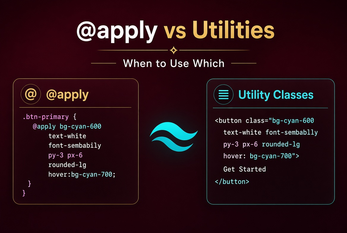
The article spent years telling people to avoid @apply. Then Tailwind v4 came along and The remaining step was to revise the opinion. The apply directive isn't bad — it's misunderstood. Used carelessly, it produces the same maintenance problems as hand-written CSS. Used thoughtfully, it produces the cleanest, most maintainable code in a Tailwind codebase. Here's the mental model It nows use to decide when to reach for @apply and when to keep utilities inline, with examples that show why each approach wins in different situations.
Why This Matters
Every team using Tailwind eventually hits this question. Junior devs copy-paste a stack of utilities into a new component, then someone says "this is duplicated, let's @apply it." A year later, the codebase has dozens of component classes, the cascade has become unpredictable, and a CSS debugging session takes longer than writing the component in vanilla CSS. That trajectory is so common that the Tailwind team has explicitly published guidance on this — yet teams keep falling into it.
There's a real architectural question buried in here. Are you using Tailwind as a styling layer (in which case utilities inline are fine) or as a design system (in which case @apply becomes a token of semantic meaning)? The answer changes how you structure your code, how you review PRs, and how you onboard new engineers. Documentation and common practice have teams split on this question and create two different codebases — one where @apply is everywhere, one where it's banned entirely. Both extremes miss the point.
The build-time implications are also real. @apply doesn't affect build performance much, but it does affect readability. A component with class="card" is opaque; you have to find the definition to know what it does. A component with class="rounded-lg border bg-white p-6 shadow-sm" is self-documenting. The trade-off matters when you're reading code at 11pm trying to ship a fix — which one lets you understand the markup faster?
The other factor is team scale. In a team of 2-3 engineers, @apply rarely helps because there's not enough repetition to justify abstractions. In a team of 20+, @apply is often necessary because the same patterns genuinely appear in dozens of places. The right answer scales with team size and code volume.
The Core Idea
The mental model Used has three tiers:
Tier 1: Inline utilities. Use this when the styling is one-off or component-specific. A hero section's gradient, a unique hover state, an unusual layout — these belong inline in JSX. Inline utilities are self-documenting and don't require you to maintain a separate definition. They make the code grep-friendly: you can search for bg-brand-500 and find every usage without following imports.
Tier 2: @apply for repeated compositions. Use this when the same combination of utilities appears in 3+ places and represents a meaningful semantic concept. Examples: a "card" pattern, a "stat tile," a "form field." The repetition justifies the abstraction, and the semantic name adds meaning. The "3+" rule is important — two occurrences is not enough to extract; you might be wrong about the pattern.
Tier 3: Component wrappers. Use this when the styling always accompanies specific behavior. A <Button> that needs an onClick handler, an <Input> that needs a ref and validation state — these are full components, not just style wrappers. The styling becomes an implementation detail of the component.
The key insight is that @apply works best for repeated patterns that have semantic meaning. It works poorly for one-off styles or arbitrary compositions. If you're tempted to extract something to @apply, ask yourself: does this name add meaning beyond what the utilities say? If the answer is "no" (i.e., the name is just a description of the utilities), keep the utilities inline.
There's also a v4-specific consideration. v4 introduces the @utility directive, which is similar to @apply but creates a first-class utility that plays well with variants. If you want your custom utility to support hover:, dark:, and responsive variants, @utility is the better tool than @apply. The semantic difference is real: @utility makes your custom class behave like bg-red-500 (a true utility), while @apply-based classes are component-style abstractions.
A useful heuristic: when you're about to write @apply, ask "would this still make sense if It every other file in the codebase?" If yes, it's a true utility — use @utility. If no, it's a contextual component — use @apply or a React component.
A Concrete Example
Let's work through four cases that illustrate the decision points.
Case 1: A one-off hero section. Inline utilities are correct:
export function HeroSection() {
  return (
    <section className="relative isolate overflow-hidden bg-gradient-to-b from-brand-50 via-white to-white py-24 sm:py-32">
      <div className="mx-auto max-w-7xl px-6 lg:px-8">
        <h1 className="text-5xl font-bold tracking-tight text-gray-900 sm:text-6xl">
          Build faster with Tailwind v4
        </h1>
        <p className="mt-6 text-lg text-gray-600 max-w-2xl">
          The new engine is dramatically faster and the CSS-first config makes
          theming a breeze.
        </p>
      </div>
    </section>
  );
}
This hero section will likely only appear once on the site. There's no repetition to extract. Keeping the utilities inline means anyone reading the code can immediately see what's being styled without jumping to a definition. The gradient is unique to this section, so even if it appears twice, that's still not enough to extract.
Case 2: A repeated card pattern. This is a great case for @apply:
/* styles.css */
@layer components {
  .card {
    @apply rounded-lg border border-gray-200 bg-white p-6 shadow-sm;
  }

  .card-interactive {
    @apply card transition-shadow hover:shadow-md cursor-pointer;
  }

  .stat-tile {
    @apply rounded-md bg-gray-50 p-4 ring-1 ring-gray-200;
  }
}
Notice that .card-interactive composes .card — that's allowed, and it's a common pattern for layered component styles. Each class represents a meaningful concept (a card, a clickable card, a stat tile) that carries semantic weight beyond the utility composition.
In JSX:
<div className="card">Static content</div>
<div className="card-interactive">Clickable card</div>
<div className="stat-tile">12,345 customers</div>
The semantic names (card, card-interactive, stat-tile) carry meaning beyond their utility composition. They represent design system concepts, not just collections of styles. Future readers know what .card is supposed to represent, even without seeing the CSS.
Case 3: A button that needs behavior. This is a full component, not a style abstraction:
// components/Button.tsx
import { ButtonHTMLAttributes, forwardRef } from 'react';

type Variant = 'primary' | 'secondary' | 'ghost';
type Size = 'sm' | 'md' | 'lg';

interface ButtonProps extends ButtonHTMLAttributes<HTMLButtonElement> {
  variant?: Variant;
  size?: Size;
  loading?: boolean;
}

const baseStyles = 'inline-flex items-center justify-center rounded-md font-semibold transition-colors focus-visible:outline-2 focus-visible:outline-offset-2';

const variantStyles: Record<Variant, string> = {
  primary: 'bg-brand-500 text-white hover:bg-brand-600 disabled:opacity-50',
  secondary: 'bg-white text-gray-900 ring-1 ring-inset ring-gray-300 hover:bg-gray-50',
  ghost: 'text-gray-700 hover:bg-gray-100',
};

const sizeStyles: Record<Size, string> = {
  sm: 'px-3 py-1.5 text-sm',
  md: 'px-4 py-2 text-base',
  lg: 'px-6 py-3 text-lg',
};

export const Button = forwardRef<HTMLButtonElement, ButtonProps>(
  ({ variant = 'primary', size = 'md', loading, className = '', children, disabled, ...props }, ref) => (
    <button
      ref={ref}
      className={`${baseStyles} ${variantStyles[variant]} ${sizeStyles[size]} ${className}`}
      disabled={disabled || loading}
      {...props}
    >
      {loading && <Spinner />}
      {children}
    </button>
  )
);
Here, the styles are joined via string concatenation rather than @apply. Why? Because the styles depend on props, which means they're dynamic. @apply doesn't support dynamic prop-driven styles — it's a static CSS directive. For dynamic styles, you use string concatenation in JS/TS. The Button is also a true component because it handles loading state, refs, and accessibility.
Case 4: A custom utility with variants. In v4, use @utility instead of @apply:
@utility btn {
  display: inline-flex;
  align-items: center;
  justify-content: center;
  padding: 0.5rem 1rem;
  border-radius: 0.375rem;
  font-weight: 600;
}

@utility btn-primary {
  background-color: var(--color-brand-500);
  color: white;
}

@utility btn-primary-hover {
  background-color: var(--color-brand-600);
}
The difference is that .btn is now a true utility: it supports variants like hover:btn-primary-hover, dark:btn-primary, etc. (when combined with other custom utilities). It's the right tool for creating reusable design tokens that should work like built-ins. Use @utility when you want your custom class to feel like bg-red-500 — a vocabulary term, not a semantic component.
Common Pitfalls
Wrapping every repeated utility combo in
@apply. Not every repetition deserves a name. If the same utilities appear twice but represent different concepts, leave them inline. Premature abstraction is the most common Tailwind mistake. The two-occurrences threshold isn't enough; wait for three or more before extracting.Using
@applyfor layout primitives. Don't create.flex-centerforflex items-center justify-center. It's too small to deserve a name; just write the utilities inline. The same goes for.text-center,.full-width, and similar one-line abstractions.Building
@applychains that duplicate component hierarchies. If you find yourself writing.modal-content { @apply card; @apply p-8; }, you probably want a real component, not an@applychain. Components handle behavior;@applyis for static styles.Forgetting that
@applyonly works inside@layer componentsor@layer utilities. In v4,@applyoutside a layer may produce errors or unexpected output. Always wrap your@applyrules in a layer — and choose the right layer for your use case.Mixing
@applyand inline utilities in the same component. Pick one approach per element. Ifcardis defined with@apply, don't override it with inline utilities — that defeats the abstraction. If you need to extend it, use the layered composition pattern shown in Case 2.Creating
btnor similar one-off component classes when a real component would do better. A.btnclass defined via@applyis inferior to a<Button>component because the component handles loading, disabled, and ref forwarding. Save@applyfor stateless visual patterns.Forgetting to delete old
@applyrules when refactoring. When you rename a component or change its styles, the@applyrule often lives in a separate CSS file. Linters won't catch the orphaned reference. Schedule periodic cleanup passes.
When to Use This (And When Not To)
Use inline utilities for: one-off sections, page-specific layouts, prototyping, anywhere the style isn't repeated. The advantage of inline utilities is grep-ability and self-documentation.
Use @apply for: design system primitives that represent semantic concepts (cards, form fields, alert banners), repeated patterns in the same codebase, anywhere a name carries meaning beyond its utility composition. The advantage is reducing visual noise in JSX.
Use full components for: anything with behavior (Button with onClick, Input with state, Form with validation), anything that needs props or refs, anything that needs accessibility handling.
Use @utility (v4) for: custom design tokens that should work like built-in utilities, supporting variants on custom styles, anywhere you'd previously written a Tailwind plugin. The advantage is variant support and first-class citizenship in the utility ecosystem.
Don't use @apply for: dynamic styles (use string concatenation in your component), one-offs (use inline), abstractions that don't carry semantic meaning (use inline), or anything that would be clearer as a real component.
A practical rule for code review: if you see @apply introducing a new class, ask "what concept does this represent?" If the reviewer can name it ("this is the alert banner pattern"), keep it. If the reviewer says "this is just rounded + p-4 + bg-white," push back.
Wrapping Up
The @apply debate is really a debate about abstraction. Used well, @apply creates meaningful, semantic CSS classes that improve readability. Used poorly, it creates a tangled web of component classes that fights the cascade. The rule is simple: extract when the abstraction carries meaning, leave inline when it doesn't. The next time you're tempted to reach for @apply, pause and ask whether the name adds anything beyond what the utilities already say. If not, keep them inline. Spend 30 minutes auditing your codebase for @apply rules that don't pull their weight and you'll find a clearer, faster codebase.
A Codebase Audit Checklist
Before you audit, Shared below a quick story. Last year The context was called in to help a team that had been adding @apply rules liberally for two years. Their components.css file had grown to 1,200 lines with 80+ class definitions, most of which were tiny abstractions over one or two utilities. When a designer wanted to change a button color, the developer had to grep through the codebase to find every place that contributed styles to a "button-like" component. Refactors took days. That team spent a sprint replacing ~60% of their @apply rules with inline utilities and saw no visual regression — they just had less code to maintain.
To help you audit your own codebase, here's a checklist you can run through. For each @apply rule in your codebase, ask these questions:
Does this name add meaning beyond the utilities? If the rule is just
rounded-lg bg-white p-6 shadow-smand the class iscard, the name doesn't add much. Inline.Does this pattern appear in 3+ places? Two occurrences isn't enough to justify an abstraction. Wait for three.
Would a new engineer understand what this class represents without seeing the CSS? If yes, keep it. If no, the name is unclear or the abstraction is too thin.
Does this rule need to support variants? If you find yourself overriding
.cardwith inline utilities often, that's a sign the abstraction isn't working. Either expand the rule or inline it.Is the rule static or does it need to be dynamic? Static =
@applycandidate. Dynamic = component or string concatenation.
For each rule that fails these checks, consider inlining. For each rule that passes, ensure it's documented and used consistently.
A Note on Performance
The performance angle on @apply is subtle. A @apply rule generates a single CSS rule with the merged properties. Inline utilities generate one CSS rule per utility used. In theory, @apply should produce smaller CSS.
In practice, the difference is usually small (a few KB) because Tailwind's tree-shaking is good. The bigger performance impact comes from how readable your code is — readable code is maintainable code, and maintainable code performs better over the long term because it doesn't accumulate hacks.
If you're optimizing for absolute minimum CSS bundle size, @apply is slightly better. If you're optimizing for maintainability, inline utilities are slightly better. The trade-off is real but small.
Real-World Patterns That Work
Over the last few years It has watched maybe thirty production codebases struggle with this exact question. The teams that got it right share a few patterns worth noting.
The first pattern is what It calls the "design system floor." They define a small number of @apply rules (5-15) for true design system primitives — things like .card, .alert, .stack, .cluster. Everything else stays inline. This creates a clear hierarchy: top-level patterns are abstractions, anything more specific is inline. New engineers learn the floor in a day and feel productive immediately.
The second pattern is the "composition boundary." A team It respected uses @apply only for patterns that need to be composed with other classes — like .btn .btn-primary .btn-lg. Each class adds one axis of variation. You can compose any combination. This makes the system feel like Lego: small pieces, predictable combinations. It also makes code review easier because you can reason about each piece in isolation.
The third pattern is "delete what you don't use." Teams that are disciplined about removing @apply rules when they're no longer needed end up with cleaner codebases. @apply rules have a tendency to hang around even when the patterns they encode have changed. Schedule a quarterly cleanup, and remove rules that aren't being referenced.
The fourth pattern, which is more cultural than technical, is "no abstractions for one-time use." Several teams It has worked with have a code review checklist item: "if you wrote @apply, link to the three places it's used." That single rule has dramatically reduced their abstraction debt. It's a tiny process change with outsized impact.
These patterns aren't universal. There's no single right way to use @apply. But if you're starting a new codebase or looking to clean up an existing one, these four patterns are a great starting point. They balance the productivity of utilities with the readability of abstractions.
When @apply Hurts More Than It Helps
If your team is dragging on every styling change, you might be over-using @apply. Here are the warning signs:
- Designers ask for a "simple" change and you estimate a half-day. Most simple changes should take minutes.
- New engineers take more than a sprint to feel productive. The styling system is too complex.
- The CSS file has more class definitions than you have components. The ratio is inverted.
- You spend more time naming classes than writing styles. Naming is hard; let utilities do the work for you.
- Refactoring a button requires changing four files. The abstraction has leaked.
If you recognize these symptoms, schedule a @apply reduction sprint. Inline everything that's used in fewer than three places. Keep only the patterns that genuinely carry semantic meaning. Your codebase will be smaller, your iteration speed will improve, and your team will be happier.
Further Reading
- Tailwind's official guidance on
@apply - [The case for utility-first CSS](https://adamwathan.the team/css-utility-classes-and-separation-of-concerns/)
- When to extract components in React
- Tailwind v4
@utilitydocumentation - Component composition vs inheritance
- The Rule of Three — when to extract abstractions

Hermes Smith