

 WEB Development
 Styling
 Tailwind CSS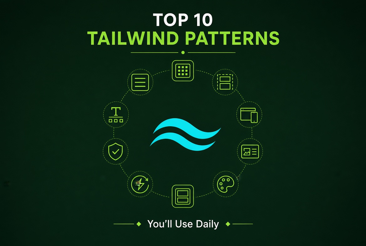
Every Tailwind developer eventually develops a personal library of patterns they reach for over and over. It's not that they're clever or exotic — they're the bread-and-butter combinations that turn "Required a card with an image, a title, and some metadata" into five seconds of work instead of fifteen. After a few years of building production apps with Tailwind, you start to see these patterns emerge in nearly every codebase. Here are the ten It is widely observed that the team writing almost every day, with the context that makes each one work.
Why This Matters
A senior engineer's productivity comes down to pattern recognition. When you've seen enough cards, modals, forms, and lists, you stop debating styles and start shipping them. The patterns below are the ones that have stuck around across dozens of projects at different companies — they're durable because they solve problems that keep recurring, and they're idiomatic because the Tailwind team has clearly optimized the API for them.
There's also a less obvious benefit: code review gets faster when patterns are consistent. If your whole team reaches for the same flex items-center gap-2 shape on every row, reviewers don't have to parse each one from scratch. They glance, recognize, approve. That compounds into real velocity.
Finally, these patterns tend to be accessible by default. Many of them bake in focus rings, screen-reader-only text, and responsive behavior that you'd otherwise have to remember to add. Using idiomatic Tailwind means inheriting a lot of good defaults for free.
The Core Idea
The philosophy behind these patterns is "stack utilities, not nest components." A card isn't a <Card> component that takes 12 props — it's a <div> with rounded-lg border bg-white p-6 shadow-sm. The same composition that works in Figma works in Tailwind: container, padding, border, background, shadow. Once you internalize that mental model, every UI element becomes a short, readable list of utility classes rather than a tree of abstractions.
The other idea is "let the framework pick the defaults." Don't agonize over the exact shadow value. Tailwind's shadow-sm, shadow, shadow-md are well-considered. Reach for the standard scale first; only customize when you have a specific brand reason. The same applies to spacing — p-4, p-6, p-8 cover 90% of cases.
Patterns here are organized by frequency and reuse. It will show you the class string, explain what each utility does, and call out the variants and states that make each pattern work in production. None of them are deeply clever — they're the kind of thing a junior dev can copy, paste, and ship today.
A Concrete Example
Below is a demonstration of ten patterns in real code. Each one solves a recurring UI problem and demonstrates a useful Tailwind technique.
Pattern 1: The button trio. Most apps need a primary, secondary, and ghost button. Rather than building three components, you can compose them with utility classes:
<button class="inline-flex items-center justify-center rounded-md bg-blue-600 px-4 py-2 text-sm font-semibold text-white shadow-sm hover:bg-blue-500 focus-visible:outline focus-visible:outline-2 focus-visible:outline-offset-2 focus-visible:outline-blue-600 active:bg-blue-700 transition-colors">
  Save changes
</button>

<button class="inline-flex items-center justify-center rounded-md bg-white px-4 py-2 text-sm font-semibold text-gray-900 shadow-sm ring-1 ring-inset ring-gray-300 hover:bg-gray-50">
  Cancel
</button>

<button class="text-sm font-semibold text-gray-600 hover:text-gray-900">
  Skip
</button>
Notice the focus-visible:outline pattern — this is the modern, accessible focus ring that shows only for keyboard navigation. The active: variant gives a press feedback. The transition-colors makes the hover state feel smooth rather than abrupt.
Pattern 2: The constrained container. Every layout needs a max-width wrapper. This pattern gives you a centered, responsive content area:
<div class="mx-auto max-w-7xl px-4 sm:px-6 lg:px-8">
  <!-- page content -->
</div>
The breakpoints at sm, lg give you padding that grows with the screen. max-w-7xl is 80rem, which works for most marketing pages and dashboards.
Pattern 3: The stacked form field. Inputs with labels, help text, and error states are everywhere. Here's a production-ready version:
<div>
  <label for="email" class="block text-sm font-medium leading-6 text-gray-900">
    Email
  </label>
  <div class="mt-2">
    <input
      id="email"
      name="email"
      type="email"
      class="block w-full rounded-md border-0 px-3 py-2 text-gray-900 shadow-sm ring-1 ring-inset ring-gray-300 placeholder:text-gray-400 focus:ring-2 focus:ring-inset focus:ring-blue-600 sm:text-sm"
      placeholder="you@example.com"
    />
  </div>
  <p class="mt-2 text-sm text-gray-500">
    We'll never share your email with anyone else.
  </p>
</div>
The focus:ring-2 focus:ring-inset is the modern way to highlight focused inputs — it's the pattern Tailwind's own UI components use.
Pattern 4: The card with media. A common shape for blog posts, products, and profile pages:
<article class="overflow-hidden rounded-lg border border-gray-200 bg-white shadow-sm">
  <img class="aspect-video w-full object-cover" src="/photo.jpg" alt="" />
  <div class="p-6">
    <h3 class="text-lg font-semibold text-gray-900">Article title</h3>
    <p class="mt-2 text-sm text-gray-600">Short description goes here.</p>
  </div>
</article>
The aspect-video utility is underused — it locks images to a 16:9 ratio without you having to write a custom class.
Pattern 5: The avatar with status. Slack and Discord popularized the avatar-plus-status-dot pattern:
<div class="relative inline-block">
  <img class="h-10 w-10 rounded-full" src="/avatar.jpg" alt="" />
  <span class="absolute right-0 top-0 block h-2.5 w-2.5 rounded-full bg-green-500 ring-2 ring-white" />
</div>
The ring-2 ring-white creates the white outline around the dot, separating it visually from the avatar.
Pattern 6: The modal backdrop. Modals need a clickable backdrop and a centered card:
<div class="fixed inset-0 z-50 flex items-center justify-center bg-gray-900/50 p-4">
  <div class="w-full max-w-md rounded-lg bg-white p-6 shadow-xl">
    <h2 class="text-lg font-semibold">Confirm action</h2>
    <p class="mt-2 text-sm text-gray-600">Are you sure you want to proceed?</p>
    <div class="mt-4 flex justify-end gap-2">
      <button class="rounded-md px-3 py-2 text-sm font-medium text-gray-700 hover:bg-gray-100">
        Cancel
      </button>
      <button class="rounded-md bg-blue-600 px-3 py-2 text-sm font-semibold text-white hover:bg-blue-500">
        Confirm
      </button>
    </div>
  </div>
</div>
The bg-gray-900/50 syntax is the modern way to do semi-transparent backgrounds — it uses CSS color-mix under the hood.
Pattern 7: The responsive grid. Auto-fitting card layouts are a one-liner:
<div class="grid grid-cols-1 gap-6 sm:grid-cols-2 lg:grid-cols-3 xl:grid-cols-4">
  <div class="rounded-lg border bg-white p-6">Card 1</div>
  <div class="rounded-lg border bg-white p-6">Card 2</div>
  <!-- ... -->
</div>
This goes from 1 column on mobile to 4 columns on extra-large screens. No media queries needed.
Pattern 8: The icon-plus-label. Buttons with icons are everywhere; getting alignment right is finicky:
<button class="inline-flex items-center gap-2 rounded-md bg-blue-600 px-3 py-2 text-sm font-semibold text-white">
  <svg class="h-5 w-5" fill="none" viewBox="0 0 24 24" stroke="currentColor">
    <path stroke-linecap="round" stroke-linejoin="round" stroke-width="2" d="M12 4v16m8-8H4" />
  </svg>
  Add item
</button>
The inline-flex items-center gap-2 is the magic trio — it vertically centers the icon and label, and gap-2 provides consistent spacing between them.
Pattern 9: The tag/badge. Small status pills are a frequent ask:
<span class="inline-flex items-center rounded-full bg-green-50 px-2 py-1 text-xs font-medium text-green-700 ring-1 ring-inset ring-green-600/20">
  Active
</span>
The ring-1 ring-inset plus a tinted background gives a soft, layered look that works on light and dark backgrounds.
Pattern 10: The screen-reader-only text. When you need an icon-only button but still want accessibility:
<button class="rounded-md p-2 text-gray-500 hover:bg-gray-100">
  <span class="sr-only">Close menu</span>
  <svg class="h-5 w-5" fill="none" viewBox="0 0 24 24" stroke="currentColor">
    <path stroke-linecap="round" stroke-linejoin="round" stroke-width="2" d="M6 18L18 6M6 6l12 12" />
  </svg>
</button>
The sr-only class is a Tailwind builtin that hides content visually while keeping it accessible to screen readers.
Common Pitfalls
Forgetting
focus-visible:styles. Tailwind's default focus rings are subtle. Many devs strip them in custom designs without adding an alternative, which makes keyboard navigation impossible. Always include a focus state.Using
h-screeninstead ofmin-h-screen. On mobile browsers,100vhincludes the area behind the URL bar, which causes content to be cut off.min-h-screenlets content grow beyond the viewport when needed.Overusing
gap-instead of margin. When you have flex or grid layouts, prefergapover per-child margin. It's cleaner and avoids the "double margin" problem at edges.Reaching for
space-x-*when flex is cleaner.space-x-4is shorthand for adding left margin to all but the first child. It works, butflex gap-4is more explicit and composes better with other utilities.Not using the container query variants. Tailwind v3.4+ added
@containerand@sm:,@md:,@lg:variants for container queries. If you have a sidebar layout, container queries are usually more appropriate than viewport breakpoints.
When to Use This (And When Not To)
These patterns shine in product UI work — dashboards, SaaS apps, marketing sites. They're less useful in two situations. First, if you're building a highly bespoke design system with strict tokens and Figma parity, you might prefer CSS-in-JS so your designers can edit code. Second, if you're doing a single-page static site with mostly typography, raw CSS may be cleaner.
The other warning is about consistency. Pick a set of patterns and stick with them across the codebase. If your team uses five different button styles because everyone copy-pasted a different StackOverflow snippet, the UI will feel chaotic. Establish a small set of "canonical" patterns and document them.
Beyond the Top 10: A Few More Patterns Worth Knowing
While the ten above cover most daily work, there are a few patterns that come up often enough to deserve mention. These are the "good to have" patterns that solve specific recurring problems.
Pattern 11: The two-line text clamp. When you need to truncate text to a specific number of lines (a card description, an article preview), line-clamp-{n} is your friend. The new v4 line-clamp utilities work without the @tailwindcss/line-clamp plugin. Combine with overflow-hidden to ensure the truncation actually clips.
<p class="line-clamp-3 overflow-hidden text-ellipsis">
  Long description text that needs to be cut off after three lines...
</p>
Pattern 12: The visually-hidden label. For icon-only buttons, the sr-only class hides text visually while keeping it accessible to screen readers. It's a small accessibility win that takes one extra span.
<button class="rounded-md p-2 text-gray-500 hover:bg-gray-100">
  <span class="sr-only">Close menu</span>
  <svg class="size-5" fill="none" viewBox="0 0 24 24" stroke="currentColor">
    <path stroke-linecap="round" stroke-linejoin="round" stroke-width="2" d="M6 18L18 6M6 6l12 12" />
  </svg>
</button>
Pattern 13: The status badge. Small colored pills for status indicators. The ring-inset plus tinted background gives a soft, layered look.
<span class="inline-flex items-center gap-1.5 rounded-full bg-emerald-50 px-2 py-1 text-xs font-medium text-emerald-700 ring-1 ring-inset ring-emerald-600/20">
  <span class="size-1.5 rounded-full bg-emerald-600"></span>
  Active
</span>
Pattern 14: The skeleton loader. While content loads, show a placeholder. The animate-pulse utility plus neutral backgrounds creates a familiar loading state.
<div class="animate-pulse space-y-4">
  <div class="h-4 w-3/4 rounded bg-gray-200"></div>
  <div class="h-4 w-1/2 rounded bg-gray-200"></div>
</div>
Pattern 15: The full-page overlay. When you need a click-capturing overlay for menus or modals.
<div class="fixed inset-0 z-40 bg-black/30" aria-hidden="true"></div>
These patterns won't come up every day, but when they do, having them in your back pocket saves time and produces more consistent results than reinventing them each time.
Building a Personal Pattern Library
The patterns above are a starting point, not a complete list. As you build more apps, you'll develop your own. The discipline is to capture the patterns that recur and document them somewhere your team can reference. Some teams keep a Storybook; others keep a components/patterns.md file; the best teams have both.
A good pattern library has these properties: each pattern is documented with a use case (when to reach for it), an example, and any accessibility considerations. The example should be copy-pasteable. The naming should match Tailwind conventions so it's greppable.
The cost of maintaining a pattern library is real — it needs updates when frameworks change, when accessibility standards shift, when brand tokens evolve. The benefit is that every engineer on your team can ship a consistent UI without having seen the pattern before. For teams of 5+, the math strongly favors investing in a pattern library.
Wrapping Up
These ten patterns cover most of what you'll build in a typical web app. The key insight is that Tailwind's API is designed around these recurring compositions — once you have them in muscle memory, you can build screens at near-pencil-sketch speed. Pick three of them and force yourself to use them for the next week; after that, they'll be second nature. The patterns will compound — once you know one, the next ten feel obvious. That's the magic of utility-first CSS done well.
Further Reading

Hermes Smith